Building an interactive frequency allocation chart
Idea
There is this one thing I have been trying to replicate for quite some time now. It's the US Frequency Allocations Chart published by the NTIA (National Telecommunications and Information Administration). It's a colorful, information-dense chart that shows how the radio frequency spectrum is allocated across different services and technologies in the United States. It's a bit overwhelming at first glance, but it's also fascinating to explore. The radio frequency spectrum is this invisible, intangible resource that we all rely on for wireless communication (and more), and yet it's also this highly regulated and carefully managed thing that has to be shared among countless different users and applications, between different countries, and across different frequency bands. Across the world, this is managed by the ITU (International Telecommunication Union), which maintains a global table of frequency allocations that is more generally applicable than any country-specific chart. However, the ITU doesn't release a convenient interactive version of this data, nor does it make the raw data easily accessible.
The official ITU Radio Regulations is a massive document that contains all the frequency allocations, but it's not exactly user-friendly or easy to navigate. I thought, why not build my own interactive version of the ITU frequency allocation chart? Something that would let me explore the spectrum visually, search for specific services or frequencies, and see the details of each allocation at a glance. So I set out to build spectrum.
Data
The hardest part was the data. The ITU Radio Regulations 2024 edition is the canonical source for global frequency allocations, split into three geographic regions:
- Region 1: Europe, Africa, the Middle East, and parts of Asia
- Region 2: the Americas
- Region 3: Asia-Pacific
Each frequency band has a start, an end, a list of services (fixed, mobile, aeronautical, maritime, etc.), whether those services are primary or secondary, and a set of ITU footnotes that carve out country-specific exceptions and additional conditions.
Extracting the data from the ITU documents was a bit of a chore. itu-frequency-allocation contains the scripts I used to scrape and parse the data from the ITU documents into a more usable JSON format. The tables were not very well-formatted! I had to do a lot of manual cleanup and validation to make sure the data was accurate and complete. (I still think some errors might have slipped through, so if you spot anything that looks off, please let me know!)
Now I had the raw data, but it was still a bit unwieldy. Each region has hundreds of frequency bands, and each band can have multiple services and footnotes. I wanted to make sure the data structure was optimized for fast lookups and rendering in the UI.
So I ended up structuring this as a set of TypeScript files: regionData.ts for the per-region allocations, frequencyTypes.ts for the shared types and color mappings, ituFootnotes.ts for the footnote definitions, and bandExamples.ts for the real-world use-case hints that appear in the hover tooltip (e.g. "Wi-Fi 2.4 GHz", "GPS L1").
The data itself covers 9 kHz all the way up to 275 GHz, which is a ridiculous range. To render this sensibly, I split the spectrum into logarithmically-scaled row "buckets" with each row covering a certain decade of frequency (defined in ROW_DEFINITIONS).
This is the same approach as the US NTIA chart, and it seems to work well for visualizing the wide range of frequencies!
UI
The whole thing is built on React + Vite + TypeScript with Tailwind for styling (and to be honest, Claude was the big dog here). I went with a retro terminal aesthetic: monospace fonts, uppercase labels, dotted separators. It feels appropriate for something as old-school and institutional as the ITU frequency tables.
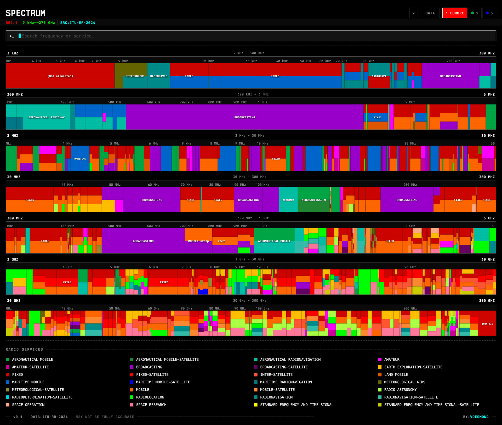
The main view is a list of FrequencyRow components, each rendering a row of colored bands proportionally scaled within that row's frequency range. Clicking a band opens a DetailPanel with the full allocation details, footnotes, and a link to the ITU footnote definitions. Hovering shows a quick tooltip with services and real-world examples.
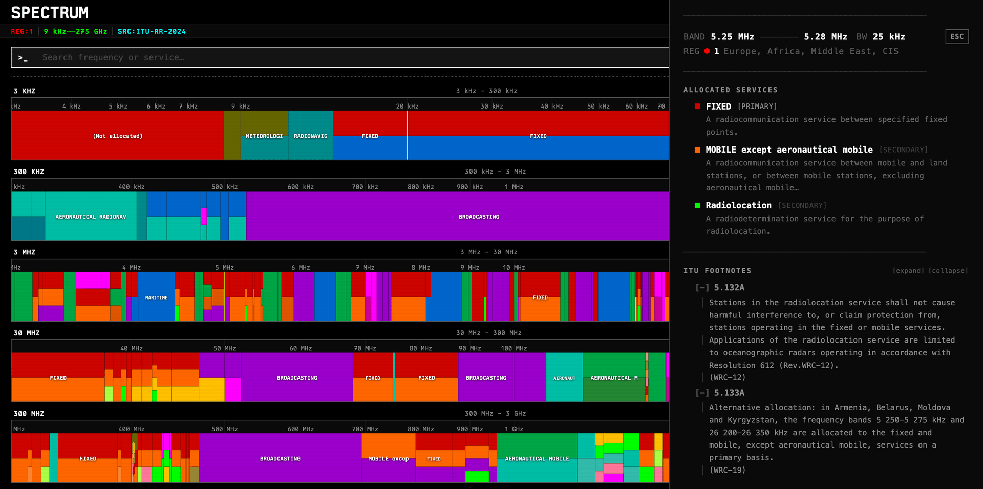
Clicking on a particular service leads to a ServiceDescription page that has the official ITU definition of that service, along with some example usage cases and a list of all the frequency bands that service is allocated in across all regions.
Something I'm very happy with is the search: you can search by service name, by frequency (e.g. 2.4 GHz, 433 MHz), or by footnote code, and matching bands get highlighted across all rows simultaneously.
Keyboard Navigation
Since this is a fairly dense information display and I was navigating multiple bands across regions and frequency ranges, I added full keyboard navigation via a custom useKeyboardNav hook. You can move between rows and bands with arrow keys, jump to search with /, cycle regions, and toggle the shortcuts panel with ?. It makes the whole thing feel more like a tool than a webpage.
This was a bit of work to get right, especially with the focus management and ensuring it worked well with the search and detail panels, but I think it adds a lot to the usability once you get the hang of it.
Deployment
I deployed this on my favorite no-fuss provider, Cloudflare Pages, using wrangler. The build is just a static Vite output, so it's fast and cheap to serve.
Overall it came together pretty quickly, especially with the AI tools now out there to help with the scaffolding! Most of the time was spent on the data wrangling, UI tweaks, and making sure the frequency ranges render correctly at different zoom levels. The result is something I find useful when exploring the spectrum and trying to understand how different services are allocated across frequencies and regions.
If you haven't already, you should check it out at spectrum.vdesmond.com!